
MONDAY MACRO: Powerful Recession Chart our recession-worried clients get from us first: Aggregate UNIFORM US Corp Debt Service (Investor Essentials)

A Powerful Macroeconomic Chart for Recession Detection That You’ve Probably Never Seen Before… it’s what we show clients who are worried about a recession.
Aggregate UNIFORM US Corporate Debt Service
Investor Essentials Daily:
The Monday Macro Report
Powered by Valens Research
One of the first questions we often get when meeting with clients is not about individual stocks. It’s more often about the outlook for the stock market and even the economy as a whole.
Understanding the macro environment is essential to any sound investing approach.
This doesn’t mean reacting to the daily ticker tape, so to speak. It doesn’t mean knee-jerk reactions to whatever news story happens to be on CNBC that day. And it certainly doesn’t mean reacting to the latest doom and gloom newsletter in your inbox.
It means having a coherent, consistent approach to analyzing the fundamentals of the market as a whole.
What many investors fail to consider is that although geopolitical uncertainty around Iran or North Korea, or the US v China trade war, can create short-term volatility, those factors alone won’t cause a recession.
After all, the stock market rose more than 25% last year with negative trade war and real war issues throughout the headlines.
Trade issues could disrupt earnings growth in the short term. However, a lack of growth in profitability will not start a recession on its own.
What will start a recession?
Creditors having to refinance debts at the very moment when they cannot.
That creates a recession and a bear market.
It is very difficult to find a major recession that didn’t start with a debt crisis. This is a global truism. However, even in just the USA alone there is ample evidence to support this phenomenon.
In 1907, 1929, 1938, almost all of the entire 1970s, major recessions and stock market collapses were preceded by corporate debt crises of some sort.
Many don’t realize that even the market drop from the “tech bubble” in 2000 was preceded by a debt crisis.
As one example, I recall colleagues in the debt capital markets in 1999 lamenting how the private placement market for debt “had entirely dried up.” Regardless of the quality of the company interested in refinancing or issuing debt, the credit markets simply weren’t interested. That is evidence of a debt crisis.
This begs the question, are we headed towards a debt crisis now? In 2020?
The answer is no. Not yet anyway. There are no near-term causes for concern that US companies might be facing a debt crisis.
Companies service their debt as it comes due in two ways: they either pay off the debt with their cash balance and cash flows, or they refinance their debt with more debt due at a later date.
Debt crises normally begin when companies are unable to refinance their debt, meaning they are on the hook to service debt using their cash. This happens when banks and creditors are no longer willing to lend. It leaves a lot of companies on the hook for servicing debt principal that they simply don’t have available.
So, by looking at an aggregate of all US corporations’ debt, cash flows, and cash on hand, we can accurately gauge the overall health and “runway” the US economy has before debt concerns become warranted.
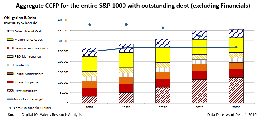
The above chart, called a CCFP for Credit Cash Flow Prime, provides a lot of detail. However, draw your focus to the top of the debt and capital requirements of the firm, the top of the bars, against the cash generated and available, the blue line and blue dots.
When the top of the bars exceed the blue line, the firm or firms represented, in total, have debt and capital requirements that exceed the annual cash flows
When the bars exceed the blue line and the blue dot, it means the debt and capital requirements exceed the firm’s cash flows AND cash on hand.
That means, 2019, 2020, and 2021 have cash requirements that exceed cash flows, but cash on hand is more than ample to handle it.
That all ends in 2022 when firms will need to exhaust all cash flows and cash on hand, and there still won’t be enough. That’s the year to worry about.
A Deeper Explanation of the Chart
The most important aspect for generating this chart is that we use UAFRS-based numbers, not GAAP or IFRS. The fact is, even the Statement of Cash Flows under GAAP is horribly distorted – and in any case, doesn’t even represent actual cash flows.
So, we build this using Uniform Adjusted Financial Reporting Standards. Also known simply as Uniform Accounting, this chart would not be meaningful using as-reported, highly distorted GAAP numbers.
We update this analysis on thousands of individual companies globally every week and make that available in our databases for clients. We aggregate those charts in a number of different ways, and run other related analytics.
In this case, the chart highlights the aggregated “Credit Cash Flow Prime” chart for the “S&P 1000,” which is the S&P 1500 minus the S&P 500.
We examine the S&P 1000 because the S&P 500 is so cash flow rich that it is seldom the source of widespread debt servicing problems. It’s one of the reasons that larger firms generally have such strong credit. Combining those firms with the whole market of corporations tends to wash out any signals.
The S&P 1000 are the companies in the S&P Midcap 400 and Smallcap 600, everything below the S&P 500.
The vertical bars represent all financial obligations US companies have. These are organized from the most flexible (blue section at the top) to the least flexible (red stripes at the bottom). This “stack” bar includes items like debt maturities, dividends, required reinvestment levels into the business, dividends, and rent..
The blue line represents the aggregation of corporate cash flows available for paying their financial obligations. The blue circles represent the level of cash available including excess cash on hand.
Companies begin to get in trouble when their cash and cash flows no longer exceed the stack.
In the above chart, cash levels and cash on hand together consistently exceed all obligations until 2022, when they fall to the middle of share buyback obligations. They fall squarely in the middle of Maintenance Capex by 2023, and aggregate debt levels have tripled.
The State of Credit Worthiness and Implication
While this picture is not ideal, it is far from bleak. Maintenance Capex is still a somewhat flexible spending category, and as long as companies are able to refinance their more urgent debt maturities, this will not be a problem.
Even if we ignore cash on hand, and just look at cash flows versus obligations, cash flows alone exceed all obligations other than share buybacks until 2022.
This further confirms the limited near-term risk of a liquidity crunch and a debt crisis. That means less chance of a recession, at least from this very powerful perspective.
Best regards,
Joel Litman & Rob Spivey
Chief Investment Strategist &
Director of Research
at Valens Research